Increasing conversion rates through a collaboration between Content Design and UX Design — Transistemas
How the redesign of the Content Design of a design flow in accordance with the improvement of UX Design creates a full experience oriented to help the customer to understand the product, and to increase conversion rates.
The product
Transistemas is a product that facilitates the connection between a user and LGBTIQ+ organizations and Non-Profits for the collection of donations. The aim is that you can find organizations that resonate with your values, and donate money to them in an easy and transparent way, so that they can continue their work and make a difference in other people’s lives.
The challenge
During desk research, it was shown that 65% of the people are interested in helping LGBTIQ+ groups and organizations with donations, but do not know how to reach them. of the increasing its reception by 25% during the first quarter. After the MPV was established, the priority was to find a user-friendly and reliable way in which the UX was built to assist the user to make the donation(s) to the LGBTIQ+ organization (s) of their choice.
Benchmarking and Competitive Analysis
One of the findings during the Benchmarking and Competitive Analysis phase showed that there is a lack of virtual products that aim to gather donations for organizations that work for the LGBTIQ+ community. Most of them are focused on generalized solutions and their target audience is broader.

Creation of a User Persona

The approach
- Registration and verification of LGBTIQ+ organizations
- Organization and categorization of organization profiles
- Handling of transactions from the user to the organization
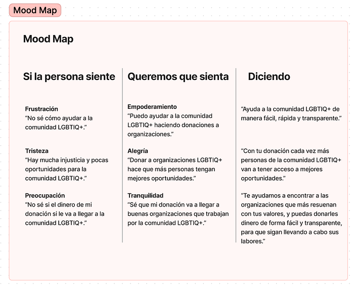
Which led to the creation of a Content Prototype and a Mood Map focused on


The Solution
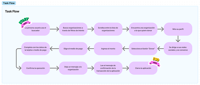
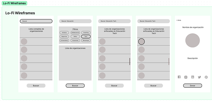
On the navigation bar, the users will tap on the option called ‘Organizations’. There can see a list of all the organizations the app has approved and verified for our users.
We have also arranged categories, where the user can search for the type of organization, the specific audience within the community they are targeting, and even where they are located. Our aim is: Why not search for a cause that the user feels aligned with when they want to support the community?
Then, let’s say that the user wants to support educational causes, so they would be able to see the different organizations that support education or teach people from the LGBTIQ+ community. Some of them are even in their vicinity or city.
Afterward, the user is able to see the profile of the organizations, but also their Instagram profile and Youtube channel, where they can see the testimonials of some of the beneficiaries. This will create a sense of trust and alignment, that will motivate the user to donate to the organization using the app. And for this, the only thing that they will have to do is select the amount they want to send them, enter their bank details, and choose if it is a one-time payment, or if they want a monthly or yearly subscription
At this point of the process, the user can also decide if they want their donation to be public or anonymous, and they can even send the organization a message of encouragement. At the end of this flow, they will receive a notification of the money transfer, and an explanation of how the organization will receive theirdonation as soon as the bank processes it, and then both parties will receive a message.


The results
The concept is that the moment the consumer enters the landing, he can read the main points of the product. To accomplish this we added two floating cards, which also work as a nexus with the next information, making more fluent the transition between sections. This is with the goal of having a dynamic explanation of how and when the user will use the Transistemas App.


